
A UX audit shouldn't be a document. It should be a list of decisions.
The brief is usually simple: take a look from the outside, tell us what's wrong and how much it would cost to fix. But the result easily turns into an 80-page PDF nobody can make head or tail of. Honestly, who reads all of it? (Not the client. Maybe the author. Maybe not even them.)
A UX audit is an outside look at your website, portal or app that shows where people get lost and ranks what to fix first. It's useful when you end up with a handful of concrete changes and can say yes or no to each one.
That's why it has no fixed template. The process is fixed, the scope and the output aren't. Those depend on what the audit needs to answer and what there is to work with. Built from a template, an audit would be too big for a small question and too shallow for a big one. Often all it takes is the product itself, a few numbers and a designer's experienced eye.
First the output, meaning what you get at the end, then how to get there: six steps that are part of every audit, and when it's worth adding more.
What a UX audit should deliver
I remember one audit from before AI. A professional agency made it, and the output was a plain Word document with screenshots of the website, sorted by page type, and a human description of what was wrong or didn't look good. It was to the point and named specific things to fix, but it was long and hard to find your way around. The client didn't really know what to do with it, so they sent it to us as a brief for the changes. I went through it line by line and added a price estimate to every item. It worked, but it wasn't productive.
There are also audits built from more sophisticated steps. They start with a workshop, continue with customer interviews, personas, a customer journey map, flows and a sitemap, a competitor comparison and user testing, and end with an extensive report. All of these steps have their place, but you often don't need them to make a decision. And if the essential part is missing, meaning clear changes you can hand straight to the team, nobody follows the result. Having an audit is one thing, being able to decide quickly based on it is another.
Today AI helps us with that too. It helps sort the findings a designer names and put them into a clear overview, including how much effort each change takes.
Every recommendation in the output answers four questions: what we change, why, what it brings and how much effort it takes. “What it brings” isn't about percentages, which nobody can honestly promise without data. It's about the mechanism, meaning how the change helps and where it shows.
Example (made up):
| What we change | Why | What it brings | Effort |
|---|---|---|---|
| The application form keeps what you've filled in when there's an error and shows the error right next to the field. | Right now the form clears after an error and people have to fill in everything again. | Probably fewer abandoned applications and fewer calls to customer support. | Medium Component update, design and development |
| The main button on the product page says what happens next, for example “Add to cart” instead of “Continue”. | Right now the label is vague and people hesitate before clicking. | Probably fewer people stopping before the next step. | Small Text change |
| Checkout lets people buy without creating an account. | Right now an account is required before payment, so some people leave at that step. | Probably fewer abandoned orders in the last step. | Bigger Change of logic and data |
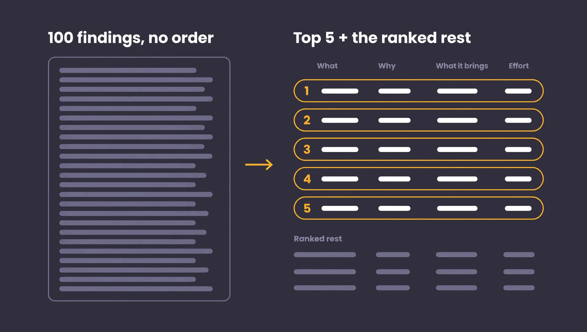
At the top you get the five most important recommendations, each with an explanation, and the rest follows, sorted by priority and effort. If you get a hundred recommendations in no particular order, you don't know where to start. The output also covers what the product does well, separates facts from hypotheses and lists open questions that can't be answered from the outside. The detailed table with severity ratings and screenshots stays as working material.
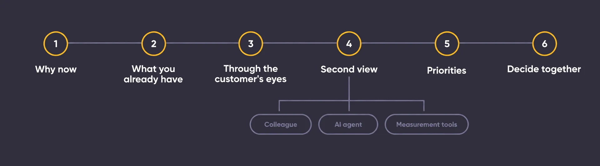
Six steps that are part of every UX audit
The order and depth change from project to project, but these six steps are part of every audit we do. The only thing that changes is how much time each one gets.
1. Why the audit, and why now
The first question we ask you isn't about screens, it's about the reason. What triggered the audit and what should it bring? Are sales down, do you need more conversions, is a new product or category coming, or are people dropping off somewhere in the process? The reason decides where the audit looks. With falling sales, mainly at the path to purchase. With a new category, more at navigation and whether people can find it at all.
The second question: who will act on the results? Management deciding on the budget needs a different output than the development team that has to build the changes.
Without these two answers, the audit finds everything and helps with nothing.
2. What you already have
At the start we find out from you what we can work with: conversion numbers, which analytics tools you use, customer feedback, traffic and performance of individual sections. Plus a few sentences about who your customer is and what they want from the product.
None of it has to be complete. A few sentences about the customer, marked as an assumption, are enough, and a persona with a photo and a name adds nothing.
And if there's no analytics? You can still do the audit, but the findings are then not proof from data, they're hypotheses with a suggestion for how to check them later. That's why we recommend setting up at least basic analytics, at the latest right after the audit. Whatever we don't know goes into the output as an open question, not as a reason to postpone the audit.
3. Going through the product as a customer
This is where the actual work starts. We click through the product the way a customer with a specific goal would, on mobile and desktop, taking quick notes, dictating and grabbing screenshots along the way. The first findings are usually the ones that jump out at you.
The technical term for this is heuristic evaluation: we compare the product against proven usability principles, for example whether it's clear where you are, what you can click and what happens after you click. On top of that we add practices that have proven themselves, like how navigation should look, where the main button belongs and how much information a single screen can handle.
The principles themselves can be read in an evening. What turns a walkthrough into an audit is the experience of a designer who has designed similar products and seen how people actually use them:
- Conventions. They know what people are used to from other websites and apps, and where your product makes them learn something new for no reason.
- Context. They know when a generally recommended practice doesn't fit your product and your customers.
- Causes, not symptoms. Five small findings often share one cause, for example poorly organized content. Fixing the cause fixes all of them at once.
- Severity. They can tell what merely slows people down and what stops them completely.
And finally we look at how people make decisions: where their attention goes, where they expect the next step and where too many options stop them.
We look with the customer's eyes, not the owner's. The owner knows where everything is, the customer has to find it.
4. An independent second view
Once we have our own notes, we add a second, independent view. It can come from a colleague or someone else on the team, but often it's an AI agent that goes through the product the way a customer would, takes screenshots and writes a first list of findings. The order matters. The second view is created separately and we write down our own findings before we see it, otherwise we'd just be looking for confirmation of what someone else wrote.
Why another view? No single person finds everything. In his article “How to Conduct a Heuristic Evaluation”, Jakob Nielsen describes how one evaluator finds roughly a third of usability problems, while five independent evaluators find around three quarters. His numbers are about people, not AI, but the principle holds: every additional independent view adds findings the first one missed. And when several of them find the same problem, that's a sign it matters.
Alongside the second view, we also collect data from tools that measure what you can't see with your eyes. They aren't another view, they're hard numbers the findings can lean on. Google PageSpeed Insights and Lighthouse show loading speed and Core Web Vitals, the speed and stability metrics Google also tracks. WAVE finds accessibility issues, like weak contrast or missing image descriptions. They work on any public page without access to the code. Slow loading isn't just a technical issue, it's a usability problem too.
Then we compare the designer's list with the list from the second view. What both find is the strongest signal and moves up, and what only one of them finds, we weigh up. The places where they disagree tend to be the most interesting. Either the real state needs checking, or it's a candidate for a test.
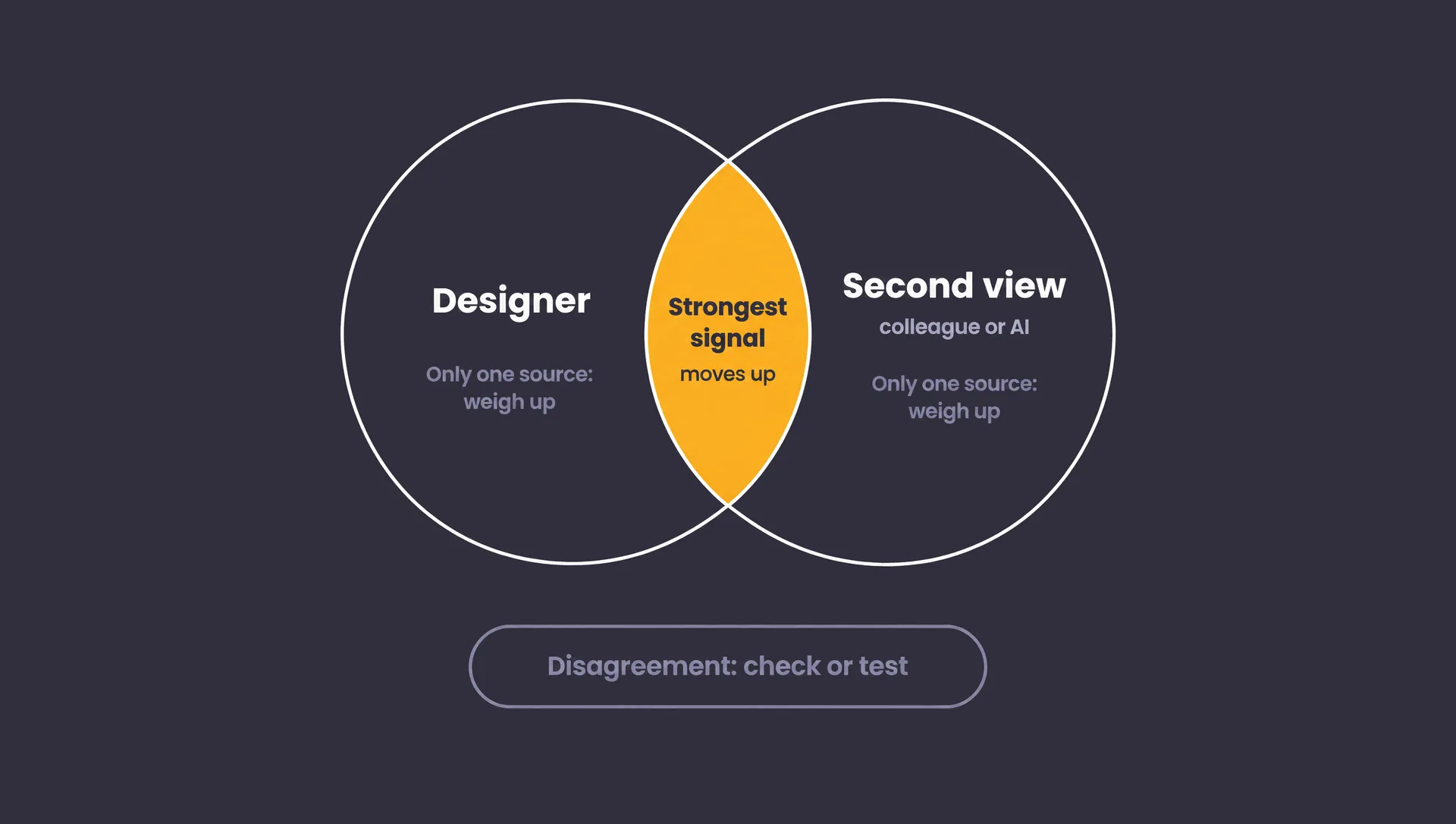
AI goes through the product systematically and quickly, and adds breadth. But details, context and what matters to a specific customer are mostly found by a person. AI is also wrong with the same confidence it's right. In one audit, for example, it described free shipping as applying to everything, when it only applied to one delivery option.
AI doesn't decide what's important. A UX designer or auditor does.
5. Ranking by value for effort
We score each finding, for example on a scale from 1 to 5, and a single formula then sets the order:
priority = (severity × location × confidence) / effort
- Severity says whether the problem merely slows a person down or stops them completely.
- Location weighs where the problem happens. The same error in the last step of an order or application weighs more than on the homepage, because that's where people want to finish what they came for.
- Confidence lowers the weight of findings based on an assumption. We flag them clearly in the output and don't push them into the conclusions.
- Effort says how much work the change takes.
Severity times location gives you impact, so it can be estimated even without analytics. We describe effort in words, so it can be estimated without a developer:
- Small change: text, a setting or moving an element, roughly hours.
- Medium change: updating a component or section, design and development, roughly days.
- Bigger change: changing a template, logic or data, roughly weeks.
The formula isn't a fixed rule, and sometimes your strategic priority wins over it. But it's easier to defend than a gut feeling.
6. Deciding together what's next
We go through the output together, one recommendation at a time, and you decide on each: yes, no or later.
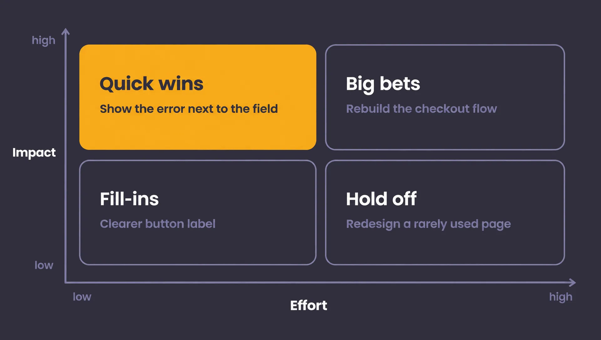
The effort from the audit serves as the basis for pricing. Development makes a precise estimate only for the recommendations that made it through, so the work can be split into phases: quick wins right away, bigger changes on the roadmap.
Open points, where the views disagree or data is missing, go to validation: an A/B test, measurement or user testing.
After the meeting, we send a short written summary of what's going to be done, who's doing it and what's still open. Otherwise everyone leaves the meeting with a different audit.
When to add more than the basics
Six steps are often enough. But if the question from step one needs a deeper look, we add more techniques, only where they make sense, not by default.
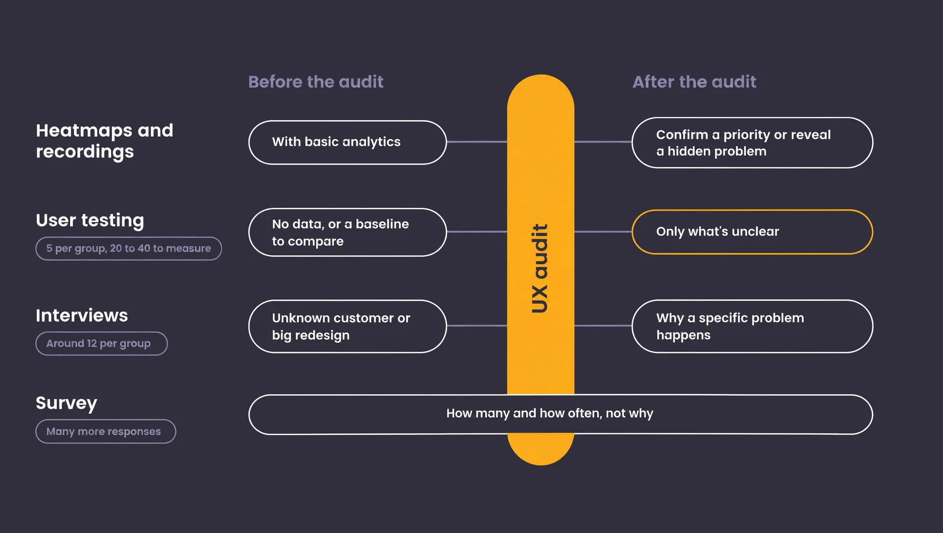
Heatmaps and session recordings. Basic analytics, like Google Analytics, is part of what you gather in step two. On top of that, it's worth adding heatmaps and session recordings from tools like Hotjar or Microsoft Clarity. They show where people click, how far they scroll and where they get stuck, and either confirm a priority or reveal a problem you couldn't see by going through the product.
User testing. It can come before or after the audit. After is more common and usually more efficient, because the audit has already found the obvious problems and you only test what's unclear or low-confidence. That way testers' time isn't spent on things you can see without them. Testing before the audit makes sense when you need to see real behavior and have no data at all, or when you want to measure a baseline and compare it after the changes.
For a qualitative test, five people from one customer group are usually enough, as Jakob Nielsen describes in his article “Why You Only Need to Test with 5 Users”. With several different groups, three or four from each will do. If you want to measure numbers, like task success, you need 20 to 40 people. For most quantitative studies, Nielsen Norman Group recommends 40.
Interviews and surveys. They give you depth you can't get from the outside: why people decide the way they do. Before the audit they help when you don't know your customer or you're preparing a new product or a big redesign. After the audit they explain why a specific problem happens. For interviews, around twelve per similar group of people is a common figure, with most themes showing up in the first six (Guest, Bunce and Johnson, 2006). A survey answers how many and how often rather than why, and needs a lot more responses.
Research is slower and more expensive, though. When we price an audit together with a redesign, research and the audit can sometimes take up to a third of the time. On a smaller project, an experienced designer can set the right direction without research, and short workshops with you fill in the missing information. They're faster and cheaper.
How long a UX audit takes and what the price depends on
The honest answer to both is the same: it depends on the scope, which is mainly set by these things:
- how many screen types and paths the audit covers, for example just the checkout or the whole product
- platforms: web, mobile, app
- what data is available and how much work it takes to process
- whether interviews, surveys or user testing are included
- how many rounds of revisions and meetings there are
That's why the scope is agreed at the start, based on the question from step one. If the audit focuses on one specific part, like checkout or sign-up, it will be shorter. If it has to cover the whole product, it will be longer or split into phases.
And if, besides the user experience, you also want to know the state of the code your product runs on, that's a different question. Our free code audit answers it.
Questions to ask your supplier
Whether you do the audit with us or someone else, these questions are worth asking before you start. Feel free to copy them into an email.
- What should the UX audit solve, and why do we actually need it?
- What will you work with if we don't have analytics?
- Can you show us an example of the output?
- How many recommendations will we get, and how will they be ranked?
- How will you tell facts from hypotheses?
- Where will you use AI, and where does a person decide?
- What will the pricing of the changes be based on?
A UX audit doesn't end at handover. It ends with the first change that goes into production.